
The Story of Our Logo and Slogan
AS-YA Tekstil has started to use its new logo as of April 2022. The previous traditional logo has taken on a new modern and global look. Our new logo is not an ordinary drawn logo, it is a set of values that brings together many meanings. From the color of our logo to our slogan, the work we do explains our work discipline and our perspective on the world and nature.
Colors
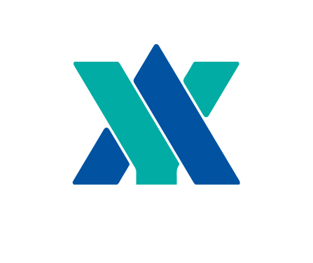
Since we are a company that protects nature, we used shades of blue and green in our logo. The turquoise in our new logo, on the one hand, is the symbol of our Turkishness, and on the other hand, comes from the color of our previous logo, which is a part of our AS-YA Tekstil essence. Blue, on the other hand, reflects our quality and that we are a strong company with the power we get from the skies, and also represents our transparency and honesty coming from the color of the sea.
Emblem
It comes together from intertwined letters A and Y. Here, the weaving of the weft and warp is illustrated. The roof shape of the letter A shows that we are a strong family working under the same roof.
Font
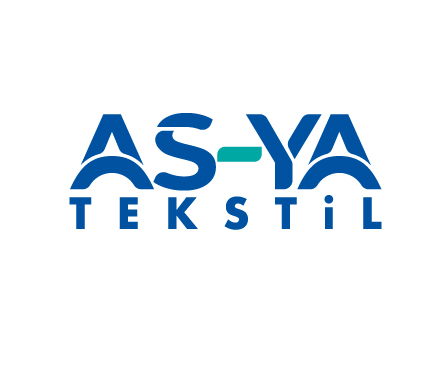
Inspired by the delicacy and soft curves of the fabric in the text. Grey fabric rolls are hidden under the letter.
Motto
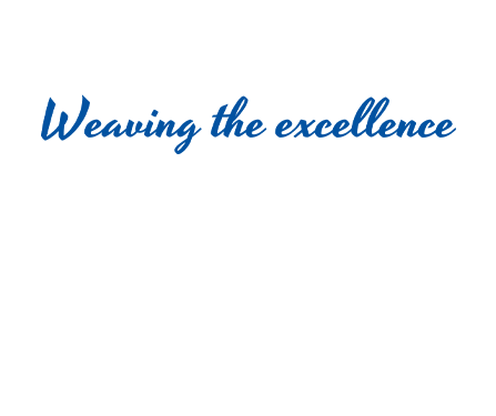
"Weaving the excellence" expresses our determination to reach perfection in all our work. From our products to our employees, we weave distinction into every single moment of our working lives. In this sense, we make excellence a part of our professional life.